
Guardian One Platform
Public Trust Clearance - Space Force
Product Design, UX Design, UI Design, Service Design
Roles: UX Engineer
Date / Time: May 2023 – Feb 2025
Tools: Figma, Zeplin, Lucid Spark, Lucid Chart, Pivotal, GitLab, Mobbin, Slack, Zoom, Microsoft Teams, Adobe Creative Cloud, Microsoft Office, Microsoft PowerPoint, Google Slides, Google Docs
Overview
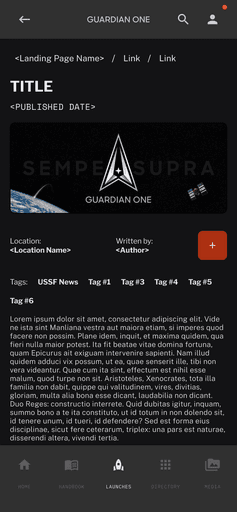
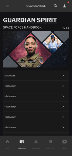
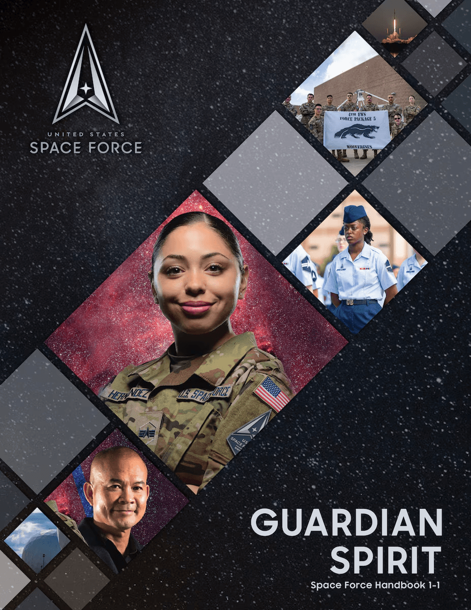
Guardian One is the official mobile application of the United States Space Force, designed to deliver mission resources, policy information, and community support through an accessible, real-time interface.
Built in Flutter and powered by a Directus CMS backend, the app centralizes critical Space Force content—such as the Guardian Handbook, news, and base resources—into a single, barrier-free platform.
Unlike the internal Space Force Portal, Guardian One provides open CAC-free access for Guardians, families, and leadership, improving transparency and reach across the organization.
As a UX Engineer, my tasks spanned research, documentation, product and interface design, interaction modeling, usability benchmarking (PURE, UX UM Lite, SUS), and service design.
I worked to connect the technical and human aspects of the project—ensuring accessibility compliance, consistent information architecture, and a scalable design system that could evolve across platforms.
The long-term goal of Guardian One is to establish a sustainable design system and shared identity for Space Force digital experiences.
As the project continues, Guardian One will serve as a foundation for future Department of Defense (DoD) and Space Defense infrastructure, supporting more integrated, accessible, and mission-aligned communications.
The Beginning: The Handbook Problem
Guardian One began with a single, direct request:
the Space Force Handbook needed to be accessible on mobile.
The existing handbook was a static PDF—difficult to search and impractical in the field.
Our six-person team was tasked to design and deliver a mobile app in 40 days that made the handbook usable anywhere, anytime.
At that point there was no portal or CMS strategy; the objective was simply accessibility.
Early Research: Building for Real Guardians
We benchmarked Air Force Connect, Air Force Portal, and VA.gov to understand how official systems handled information and why they frustrated users.
Each offered valuable content—directories, base pages, and news—but buried it behind CAC/SSO logins, deep navigation, and slow interfaces.
The insight was clear: Guardians didn’t need more data; they needed faster, barrier-free access to essential material.
Because we were operating under strict time and budget constraints, the team relied on lightweight, high-impact research methods that could deliver measurable insight quickly.
This approach included PURE expert reviews, UX UM Lite surveys, and targeted usability studies.
Each technique provided actionable data without the need for extensive recruiting or external funding.
These compact methods became an efficient way to benchmark usability and validate design direction in real time.
Expert Forecast: Predicting Usability Before Code
To test the design concept before development, we ran a PURE (Practical Usability Rating by Experts) evaluation against Air Force Connect.
PURE provided a task-based, expert perspective on ease of use, allowing us to establish a measurable baseline early without a large participant pool.
System
Score
Ease Index
Interpretation
Air Force Connect (Mobile)
61 / 102
60.5
High-friction baseline
Air Force Connect (Mobile)
34 / 78
84.5
Predicted high ease of use
Experts forecasted roughly 30 percent less task friction, setting a clear usability target before any code was finalized.
MVP: The 40-Day Launch
Built in Flutter, the first release made the handbook searchable, readable, and accessible without CAC or SSO.
The initial UX UM Lite (SUS) study returned 62.97, confirming strong usability but limited usefulness due to static content.
This early user testing was intentionally lean — low cost, remote, and time-bound — designed to validate the experience without overextending project resources.
The result provided a solid baseline for further improvement once live data became available.
Focus Groups: Designing for Families and the Force
After launch, leadership sponsored a set of focus groups to determine what features would make the app more valuable to different user groups.
These sessions were conducted through internal channels, using existing Guardian and spouse communities, which kept the research lightweight while still capturing qualitative insights.
Leadership spouses and families requested:
Family support resources
Local base information
Clear communication from leadership
Their focus was connection, transparency, and shared awareness across the Guardian community.
What Guardians Asked For vs. What Actually Drove Value
Guardians requested person lookup and unit/base pages, similar to features already available in the Space Force Portal, Air Force Portal, and Air Force Connect. However, both PURE and SUS results indicated little to no usability improvement from these features.
The friction came not from the tools themselves but from how hard they were to access and how inconsistent the information felt.
In contrast, family-focused additions—base resources, support links, and local connections—produced higher retention and repeat visits.
Users valued immediacy and clarity more than structural familiarity.
Design implications
Avoid duplicating portal-style directories.
Prioritize top tasks and visible content pathways.
Preserve the mobile app’s barrier-free model as a core design value.
Integration: Making the App Dynamic
Integrating Directus CMS transformed Guardian One from a static reference into a living information system.
This connection allowed content updates to propagate instantly across devices, keeping the information current and accurate without app redeployment.
Round
Metric
Score
Δ Change
Interpretation
R1 (Pre-CMS)
SUS
62.97
-
Functional but static
R2 (Post-CMS)
SUS
72.40
9.43
Above-average usability; validated PURE prediction
The nine-point improvement confirmed the PURE Ease Index (84.5) as a reliable early predictor and demonstrated how live, accessible content directly enhances perceived usability.
The Guardian One Journey
A case study of delivering a new CICD pipeline
As Guardian One matured, the team established the Guardian One Design System, later extended into the Space Force Portal redesign.
Core principles
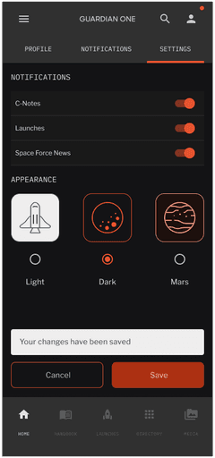
Accessibility-first: WCAG 2.1 and Section 508 compliance.
Design tokens: Figma-to-Directus schema alignment for color, typography, and spacing.
“Mars Mode”: high-contrast, accessible palette optimized for operational and low-light use.
Guardian Ideal alignment: Character, Connection, Commitment, Courage, Resiliency.
The design system unified Space Force digital experiences under a consistent, accessible framework that could scale across secure and public environments.
This case study goes over the current journey of Guardian One and how it supports three products for the Space Force
View now

What I Learned
Guardian One began as a handbook conversion but evolved into a demonstration of how small, efficient research cycles can deliver significant usability gains.
PURE predicted actual usability outcomes. The 84.5 Ease Index forecasted the later 72.4 SUS improvement.
Family-centered content drove engagement. Practical, low-friction information outperformed directory-based features.
Lean methods can be predictive. Quick, low-cost studies—PURE, UX UM Lite, and targeted usability testing—provided actionable insight without extensive resources.
Access is value. Guardians asked for tools, but the real success came from removing barriers to information.
Design systems amplify consistency. The Guardian One Design System proved accessibility, and identity can coexist in government products.
Reflection
The next phase of Guardian One should focus on continuing PURE and SUS benchmarking while expanding participation.
Usability research should include families, community partners, and external organizations, not just leadership and service members, to capture the full user ecosystem.
The Directus CMS remains central to managing and synchronizing updates across mobile and web, but a new evaluation of the Space Force Portal / Guardian One Portal is needed to ensure that both platforms achieve the same accessibility and clarity demonstrated on mobile.
While the team delivered on accessibility and usability, the broader institutional challenge persists.
Within the defense ecosystem, products like Guardian One rarely receive sustained investment because they don’t directly produce monetary or mission outputs.
However, their contribution is no less vital—they strengthen trust, connection, and communication within the Space Force community.
Additional Information
The U.S. Space Force was established on Dec. 20, 2019, when the National Defense Authorization Act was signed into law, creating the first new branch of the armed services since 1947. The establishment of the USSF resulted from widespread recognition that space is a national security imperative. When combined with the growing threat posed by strategic competitors in space, it became clear that there was a need for a military service focused solely on pursuing superiority in the space domain.
For any additional information about Space Force learn more at this link
This modernizing proceeded with the 21st Century Integrated Digital Experience Act, signed in 2018. Learn more at this link summarizing the act.
To keep records safe, the U.S Government is also subject to the Paper Reductions Act. Learn more about that act through this public link